Pricing Tables That Help People Decide: A Design Guide for React and Tailwind
 Uncode UI
7 min read
Uncode UI
7 min read
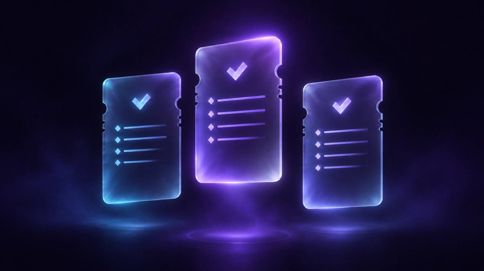
A pricing table is a decision tool
Most pricing sections are built as if their job were to list everything the product can do. That is the wrong brief. By the time someone scrolls to your plans, they already think the product might be useful. What they need now is help answering a much narrower question: which of these options is mine, and what happens if I pick wrong?
Seen that way, a pricing table is less a brochure and more a small piece of decision software. Every card, label and toggle either makes the choice easier or adds one more thing to compare. This guide walks through the choices that matter when you build one in React and Tailwind, with examples from today's additions to the Uncode catalog.
Start with the reader, not the feature list
Before you touch layout, write one sentence per plan that describes who it is for. Not what it includes: who it is for. "For solo builders shipping a first project." "For growing teams that need more room to build." If you cannot write that sentence, the plan probably should not exist, or it overlaps with another one.
Those sentences belong at the top of each card, right under the plan name. They do more work than the feature list below them, because they let people self-select before reading any detail. The Blueprint Tiers component bakes this in with a dedicated tagline slot and a minimum height, so short and long taglines still line up across the row.
Three tiers, one recommendation
Three plans is a common pattern for a reason. It gives a clear low end, a clear high end, and a middle option that most people can land on without agonising. Two plans can work for very simple products. Five or more usually means you are pushing segmentation work onto the visitor.
Whatever the count, highlight one plan. Not with three competing badges, but with a single, calm signal: a filled button where the others are outlined, a short "Popular" label, a slightly lifted card. The highlighted plan is a suggestion, and people who are unsure are often glad to take it. If everything is emphasised, nothing is.
Be honest about which plan you highlight. If the recommended tier is the one that suits most of your customers, the badge builds trust. If it is simply the most expensive option, people notice, and the whole table starts to feel like a sales tactic.
Make the numbers easy to compare
Prices should be the largest figures in each card, aligned on the same baseline, in the same format. Pick one unit and stick with it. If one plan says "per month" and another says "billed annually" in different positions, readers have to do arithmetic, and arithmetic is where hesitation starts.
A few details make a noticeable difference:
- Use tabular numerals (the
tabular-numsutility in Tailwind) so digits do not shift width when prices animate or change. - Keep the currency symbol and the period label visually quieter than the number itself.
- If a plan is free, say what free means in plain words: "No credit card required" is more useful than an extra badge.
- For custom or enterprise plans, replace the price with a clear label rather than an empty space, so the row still reads as complete.
Billing toggles without the bait and switch
Monthly versus yearly toggles are useful, but they are also one of the easiest places to lose trust. The classic mistake is showing a low yearly price per month in huge type, with the actual annual charge hidden in small print. People do find out, usually at checkout, and that is the worst possible moment.
A better pattern is to show the per month figure and the total that will actually be charged in the same view. Label the saving in concrete terms, like "2 months free", instead of a vague percentage. When the toggle changes the price, animate the number briefly so the eye catches the change, then let it settle. Blueprint Tiers uses a per plan switch and a short counting animation on the price for exactly this reason, and it respects prefers-reduced-motion by snapping straight to the final value.
Whatever you choose, make the toggle a real control. Use a button with role="switch" and aria-checked, give it a visible focus ring, and label it with the plan it affects when there is more than one.
Uncode UI
Build with AI, not against it.
Over 1,400 React and Tailwind components that run live in the browser, with a prompt ready to paste into Claude, Cursor or v0. Plus a community of people building real sites with AI.
Personality is allowed
Pricing tables have a reputation for being the dullest part of a landing page, and many of them are. There is no rule that says they have to be. A distinctive treatment can make plans memorable, as long as the comparison still works.
The Receipt Tiers component is a good example. Each plan is rendered as a thermal receipt, with dotted leaders, a subtotal, a discount line and a rubber stamp for the featured tier. It is playful, but the structure underneath is still a strict comparison: every receipt has the same rows in the same order, and the total is always the boldest line. That is the trick with expressive pricing. Change the costume, keep the skeleton.
Put proof next to the price
The moment someone looks at a price is the moment they ask whether it is worth it. That is exactly where social proof earns its place. A short quote from a real customer, placed just above or below the plans, answers the question at the time it is being asked.
Keep testimonials specific. "Great product" tells the reader nothing. A line about a concrete outcome, attributed to a real name and role, carries far more weight. Never invent quotes or borrow logos you do not have permission to use; fake proof is easy to spot and damages the credibility of everything else on the page.
The format can vary with the space you have. Inline Testimonials weaves customer names into a paragraph and opens a quote card on hover or focus, which works well in a short case study above the plans. Circular Testimonials gives each voice a large portrait and a quote that reveals word by word, better suited to a dedicated section. Design Testimonial takes an editorial route with oversized numerals and a vertical progress line.
Buttons that say what happens next
Each plan ends with a call to action, and the label on that button matters more than its colour. "Get started" is fine. "Start free trial" is better when it is true, because it tells people what they are committing to. "Talk to sales" sets the right expectation for a plan that needs a conversation.
Only the recommended plan should get the loudest button. The others can be quieter variants of the same shape, so the row feels consistent. If you want a little tactile feedback, a pushable button like Magic Button or a bracketed one like Frame Button can add character without competing with the prices, as long as you use it on one plan and not all three.
Accessibility and layout checks
Before shipping, run through a short list:
- Plans stack cleanly on small screens, with the recommended plan still easy to find. Consider placing it first on mobile.
- Feature rows use real lists, and included or excluded states are announced as text, not only as icons.
- Colour is never the only signal for the highlighted plan; there is also a label or a change in shape.
- Entrance animations fade in quickly and never hide prices behind a scroll trigger that might not fire.
- Contrast holds on dark backgrounds, especially for muted secondary text like billing notes.
Bringing it into your project
You do not need to design a pricing section from a blank canvas. Start from a component whose structure already fits your plans, swap in your own copy and figures, and spend your time on the parts that are specific to your product: the taglines, the recommendation, and the proof.
Every component mentioned here is in the Uncode catalog with a live preview and copyable code. If you work in Claude Code, Cursor or another editor with MCP support, you can also connect the catalog to your editor and ask for a pricing section by name, then adjust it in place. The goal is the same either way: a table that helps people choose, and then gets out of their way.
Uncode UI
Build with AI, not against it.
Over 1,400 React and Tailwind components that run live in the browser, with a prompt ready to paste into Claude, Cursor or v0. Plus a community of people building real sites with AI.